Here we want to answer how Ozone is transported from the Metropolitant area to the surroundings. For that, we chosen five stations that measure ozone in Sao Paulo State and that are align like the predominant wind in this zone: southeasterly .Then, we’ll see at what time, during the day, they register the highest ozone concentration. To summarized the information, we’ll use a heatmap. I tried to do it using R Base Graphic, but I have to admit that I like more the ggplot2 version.
Selecting the stations
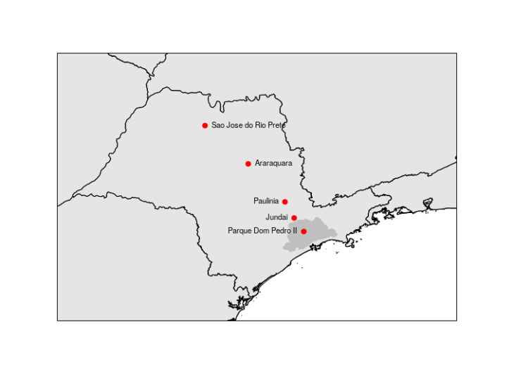
We selected 5 stations: Parque Dom Pedro II, Jundai, Paulinia, Araraquara, Sao Jose do Rio Preto. To get sure that these stations are aligned, we can plot a simple map to double check. I followed this previous post. The grayer zone is the Metropolitan Area of Sao Paulo.
library(maps)
library(mapdata)
library(maptools)
library(rgdal)

station_data <- data.frame(name = c('Parque Dom Pedro II',
                                    'Jundai', 'Paulinia', 'Araraquara',
                                    'Sao Jose do Rio Preto'),
                           lat = c(-23.5448, -23.1920, -22.7723, -21.7825, -20.7846),
                           lon = c(-46.6276, -46.8976, -47.1548, -48.1858, -49.3983),
                           stringsAsFactors = F)

# Brazil states shapefile from:
# https://data.humdata.org/dataset/brazil-administrative-level-0-boundaries

brazil_states <- readOGR('./brazil_states/BRA_adm1.shp')
rmsp <- readOGR('./rasters/rmsp/MunRM07.shp')

map("worldHires","Brazil", xlim=c(-53.44,-42.44), ylim=c(-25.80,-18.97), col="gray90", fill=TRUE)
plot(brazil_states, add = T, xlim=c(-53.44,-42.44), ylim=c(-25.80,-18.97))
plot(rmsp, add=T , lwd=1.5, border='gray75', col='gray75', fill=TRUE)
points(station_data$lon, station_data$lat, col = 'red', pch=19)
text(x = station_data$lon[4:5], y = station_data$lat[4:5], labels = station_data$name[4:5], pos = 4, cex = 0.7)
text(x = station_data$lon[1:3], y = station_data$lat[1:3], labels = station_data$name[1:3], pos = 2, cex = 0.7)
box()
Downloading the data
Once we confirmed the position of the stations, we download the hourly data from 2018, to then calculate the hourly means (the daily profile of Ozone). We followed this previous post.
library(RCurl)
library(XML)
library(stringr)
library(zoo)

CetesbRetrieveCut <- function(user.name, pass.word,
                              pol.name, est.name,
                              start.date, end.date){

  curl = getCurlHandle()
  curlSetOpt(cookiejar = 'cookies.txt', followlocation = TRUE, autoreferer = TRUE, curl = curl)

  url <- "https://qualar.cetesb.sp.gov.br/qualar/autenticador"

  # To actually log in in the site 'style = "POST" ' seems mandatory
  postForm(url, cetesb_login = user.name, cetesb_password = pass.word,
           style = "POST", curl = curl)

  url2 <-"https://qualar.cetesb.sp.gov.br/qualar/exportaDados.do?method=pesquisar"

  # Start the query
  ask <- postForm(url2,
                  irede = 'A',
                  dataInicialStr = start.date,
                  dataFinalStr = end.date,
                  iTipoDado = 'P',
                  estacaoVO.nestcaMonto = est.name,
                  parametroVO.nparmt = pol.name,
                  style = 'POST',
                  curl = curl)
  pars <- htmlParse(ask, encoding = "UTF-8") # 'Encoding "UTF-8", preserves special characteres
  tabl <- getNodeSet(pars, "//table")
  dat <- readHTMLTable(tabl[[2]], skip.rows = 1, stringsAsFactors = F)

  # Creating a complete date data frame to merge and to pad out with NA
  end.date2 <- as.character(as.Date(end.date, format = '%d/%m/%Y') + 1)
  all.dates <- data.frame(
    date = seq(
      as.POSIXct(strptime(start.date, format = '%d/%m/%Y'),
                          tz = 'America/Sao_Paulo'),
      as.POSIXct(strptime(end.date2, format = '%Y-%m-%d'),
                          tz = 'America/Sao_Paulo'),
      by = 'hour'
    )
  )

  # These are the columns of the html table
  cet.names <- c('emp1', 'red', 'mot', 'type', 'day', 'hour', 'cod', 'est',
                 'pol', 'unit', 'value', 'mov','test', 'dt.amos', 'dt.inst',
                  'dt.ret', 'con', 'tax', 'emp2')

  # In case there is no data
  if (ncol(dat) != 19){
  dat <- data.frame(date = all.dates$date , pol = rep(NA, nrow(all.dates)))
  } else if (ncol(dat) == 19) {
  names(dat) <- cet.names
  dat$date <- paste(dat$day, dat$hour, sep = '_')
  dat$date <- as.POSIXct(strptime(dat$date, format = '%d/%m/%Y_%H:%M'))
  dat <- merge(all.dates, dat, all = T)
  dat$value <- as.numeric(gsub(",", ".", gsub("\\.", "", dat$value)))
  }
  if (nrow(dat) == nrow(all.dates)){
    dat <- data.frame(date = all.dates$date , pol = dat$value)
  } else {
    print(paste0('There is a duplicated date in: ', dat$date[duplicated(dat$date)]))
    dat <- data.frame(date=dat$date, pol=dat$value)
  }
  return(dat)
}

pdp <- CetesbRetrieveCut(user.name, pass.word, 63, 72, start.date, end.date)
jun <- CetesbRetrieveCut(user.name, pass.word, 63, 109, start.date, end.date)
pau <- CetesbRetrieveCut(user.name, pass.word, 63, 117, start.date, end.date)
ara <- CetesbRetrieveCut(user.name, pass.word, 63, 106, start.date, end.date)
sjr <- CetesbRetrieveCut(user.name, pass.word, 63, 116, start.date, end.date)
Calculating the daily profile
Now we got the data for all the stations. So we calculate the daily profile by calculating the hourly means. We followed this previous post. Finally, we plot the results using R Base Graphic.
# Function to calculate hourly means
HourlyProfile <- function(df){
  h.df <- aggregate(df['pol'], format(df['date'], '%H'), mean, na.rm = T)
  return(h.df)
}
# Calculating hourly means

pdp.h <- HourlyProfile(pdp)
jun.h <- HourlyProfile(jun)
pau.h <- HourlyProfile(pau)
ara.h <- HourlyProfile(ara)
sjr.h <- HourlyProfile(sjr)

# Plotting
plot(pdp.h$date, pdp.h$pol, t = 'l', lwd = 1.5, col = 'red', ylim = c(0, 100),
xlab = 'Hours', ylab=expression("O"[3] * "(" * mu * "g m" ^-3 * ")"))

lines(jun.h$date, jun.h$pol, t = 'l', lwd = 1.5, col = 'green')
lines(pau.h$date, pau.h$pol, t = 'l', lwd = 1.5, col = 'orange')
lines(ara.h$date, ara.h$pol, t = 'l', lwd = 1.5, col = 'blue')
lines(sjr.h$date, sjr.h$pol, t = 'l', lwd = 1.5, col = 'black')
legend('topleft', col = c('red', 'green', 'orange', 'blue', 'black'), lty = c(1, 1, 1, 1 ,1),
legend = station, bty = 'n')
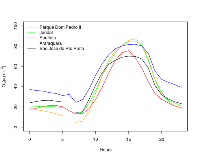
Here, we see that highest concentrations happens far from the Metropolitan Area, in Jundai and Paulinia, and then start decreasing in northwest direction. This plot is a little bit messy, we'll try to display it better using heatmap.
Creating a heatmap
By following the R Graph Gallery and the aesthetic shown in Fundamentals of data visualization (a great great book!) , we translate the previous plot in a heatmap.
library(ggplot2)
library(viridis)
times <- seq(0, 23)
station <- c("Parque Dom Pedro II", "Jundai", "Paulinia", "Araraquara", "Sao Jose do Rio Preto")

data <- expand.grid(X=times, Y=station) # Creating a grid with times and stations coordinates
data$o3 <- c(pdp.h$pol, jun.h$pol, pau.h$pol,ara.h$pol, sjr.h$pol) # We arranged the data in a vector
ggplot(data, aes(X, Y, fill = o3)) +
geom_tile(width=.95, height=0.95) + # This puts with lines in the grid (with width and height)
scale_fill_viridis_c( name=expression("(" * mu * "g m" ^-3 * ")")) + # We used viridis color pallette and put a name to colorbar
scale_y_discrete() + # Our stations are a discrete variable
coord_fixed(expand=F) + # To fixed in 0 - 23 hours
xlab('Hours') + ylab('') +# X and Y axes label
theme(panel.background = element_blank(),plot.background = element_blank()) # Remove the gray background of ggplot2
This is the result:

From this plot we can see clearer that:
- Jundai and Paulinia have highest concentration than Parque Dom Pedro II (were more precursors are emitted: NOX and COV). This behavior can be explained because Ozone is a secondary pollutant, so it takes time to form. Also, it has a lifetime long enough to be transported, so it can travel from the metropolitan area to inside the state. And that’s why there is also a delay in the ozone peaks.
- See how the farest stations (Araraquara and Sao Jose do Rio Preto) have higher concentration during the night. This could happens because there is less emission of NOx during the night that can consumed the formed/transported Ozone. In Parque Dom Pedro II, which is located inside the Metropolitan Area, there are still emission of NOx during night and also all the emission emitted during the day which consume Ozone, some of this NOX is also transported which consumes Ozone in Jundai and Paulinia.
- So It seems that I have to plot the NOx daily profile to be sure. Let’s save it for another post.

Many thanks, my friend. I’m grateful thanks to you.
LikeLiked by 1 person