I’m not a fan of ggplot, It isn’t that I don’t like it, but I first learned to do my plots using R Base graphics and until now it didn’t let me down (But I have to admit that sometimes it was a pain in the ass).
So, here I want to show some examples of how to make a temporal concentration variation plots on R, and how to calculate daily and monthly means from hourly data. The key is to tell R that the “date” column is actually containing POSIXct variables and not text (string or character), then R do the rest.
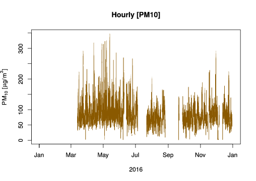
In this example, we worked with PM10 hourly data from Santa Anita Station.
Some highlights:
- The openair package can calculate all of this stuff faster, but it used lattice to do the plots.
- expression function is convenient to write sub-index and special character for concentration units
- Sometimes is better to make a clean plot (t = ‘n’) and then draw the lines separately, in order to avoid grid be plotted over the concentration line.
library(RCurl)

# GET example
openaq <- "https://api.openaq.org/v1/measurements"

## Retriving information
pm10 <- getForm(openaq,
format = 'csv',
location = 'Santa Anita',
parameter = 'pm10',
date_from = '2016-01-01',
date_to = '2016-12-31')

# Saving in a data frame
data <- read.table(textConnection(pm10), header = T,
sep = ',', dec = '.', stringsAsFactors = F)

# Telling R that date column is a POSIXct, `local` is the column with the local date information
# We create another column called `date`
# See openair user guide: Using R to analyse air pollution monitoring data
data$date <- as.POSIXct(strptime(data$local, format = '%Y-%m-%dT%H:%M:%S-05:00'), tz = 'America/Lima')

# Filling the blanks
all.data <- data.frame(date = seq(as.POSIXct('2016-01-01 00:00', tz = 'America/Lima'),
as.POSIXct('2016-12-31 23:00', tz = 'America/Lima'),
by = 'hour') )
data <- merge(all.data, data, all = T)

data$value[data$value <= 1] <- NA # Cleaning the data, concentration less than 1 ug/m3 are NA

plot(data$date, data$value, t = 'l', col = 'orange4',
main = "Hourly [PM10]",
ylab = expression(PM[10]~"["*mu*"g/"*m^{3}*"]"),
xlab = "2016")
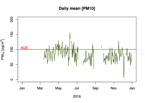
We used aggregate function to calculate the daily means (“%Y-%j”). Peruvian Air Quality Standard (AQS) for PM10 is based on daily means, so we draw a line (abline) to evaluate how many days this standard is surpassed. To calculate how many days the AQS was surpassed you can use this formula: sum(daily.means$value >= 100, na.rm = T), and we got that in 2016, 50 days had PM10 concentration higher than the AQS.
daily.means <- aggregate(data['value'], format(data['date'], '%Y-%j'), mean, na.rm = T)
daily.means$date <- seq(min(all.data$date), max(all.data$date), by = 'day')

plot(daily.means$date, daily.means$value, t = 'n', ylim = c(0,200),
ylab = expression(PM[10]~"["*mu*"g/"*m^{3}*"]"),
xlab = '2016',
main = 'Daily mean [PM10]')
lines(daily.means$date, daily.means$value, t = 'l', lwd = 1.5, col = 'darkolivegreen')
abline(h = 100, col = 'red', lwd = 1.5)
text(as.numeric(daily.means$date[10]), 105, labels = 'AQS ', col = 'Red')

# To calculate number of days that surpassed the AQS
sum(daily.means$value <= 100, na.rm = T)
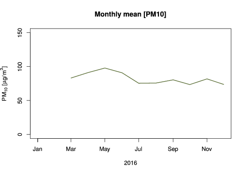
Usually, monthly mean plots are helpful to evaluate a pollutant seasonality, for example, how it behaves on summer or in winter.
monthly.means <- aggregate(data['value'], format(data['date'], '%Y-%m'), mean, na.rm = T)
monthly.means$date <- seq(min(all.data$date), max(all.data$date), by = 'month')

plot(monthly.means$date, monthly.means$value, t = 'n', ylim = c(0,150),
ylab = expression(PM[10]~"["*mu*"g/"*m^{3}*"]"),
xlab = '2016',
main = 'Monthly mean [PM10]')
lines(monthly.means$date, monthly.means$value, t = 'l', lwd = 1.5, col = 'darkolivegreen')
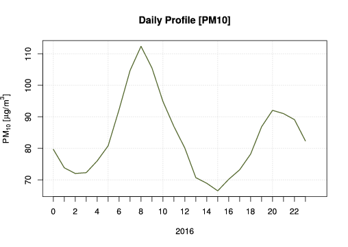
Finally, a daily profile with hourly means helps us to understand in what hours of the day we have higher concentrations, in this cased we have higher values at 8:00 and 20:00, which are related to vehicles traffic emissions.
hourly.means <- aggregate(data['value'], format(data['date'], '%H'), mean, na.rm = T)
plot(hourly.means$date, hourly.means$value, t = 'n', lwd = 1.5, col = 'darkolivegreen',
xlim = c(0, 24),
ylab = expression(PM[10]~"["*mu*"g/"*m^{3}*"]"),
xlab = '2016',
main = 'Daily Profile [PM10]',
axes = F)
grid()
lines(hourly.means$date, hourly.means$value, t = 'l', lwd = 1.5, col = 'darkolivegreen')
axis(2)
axis(1, at = 0:23, labels = 0:23)
box()
* Some of these scripts are based on the openair package manual.

2 thoughts on “Plotting pollutant concentrations on R”